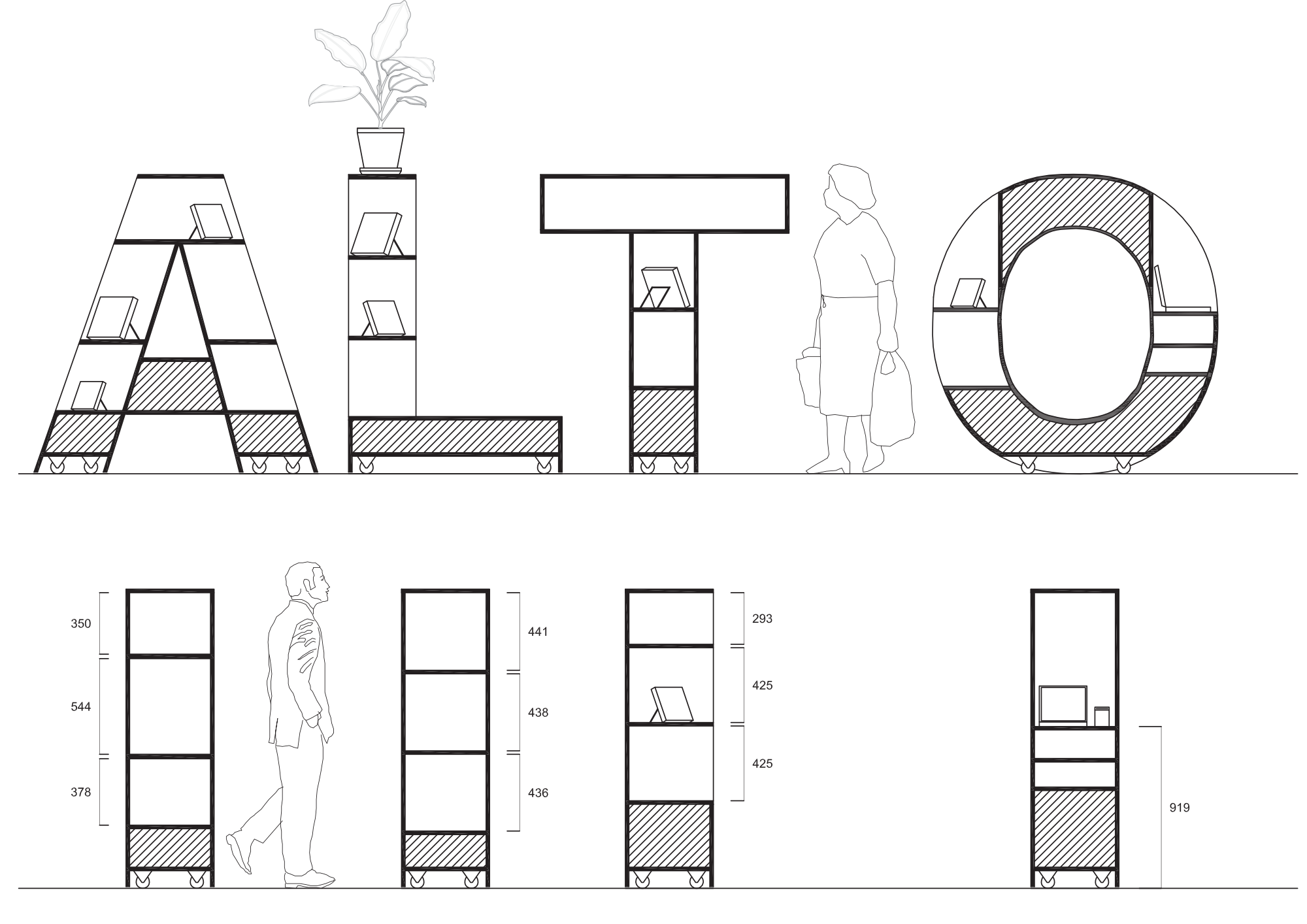
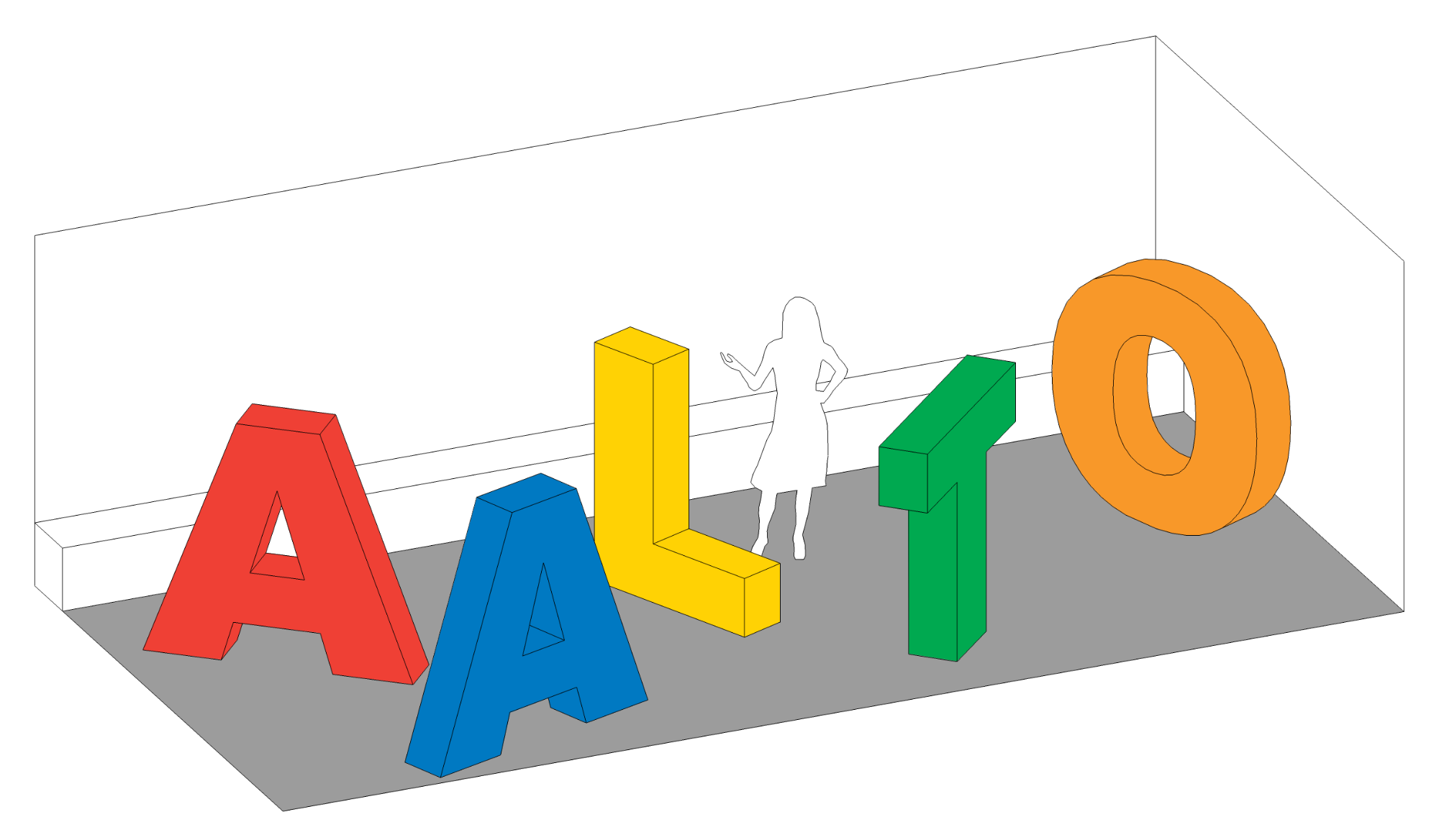
Aalto Arts Books Book Fair Stand
2012
Client: Aalto Arts Books publishing house
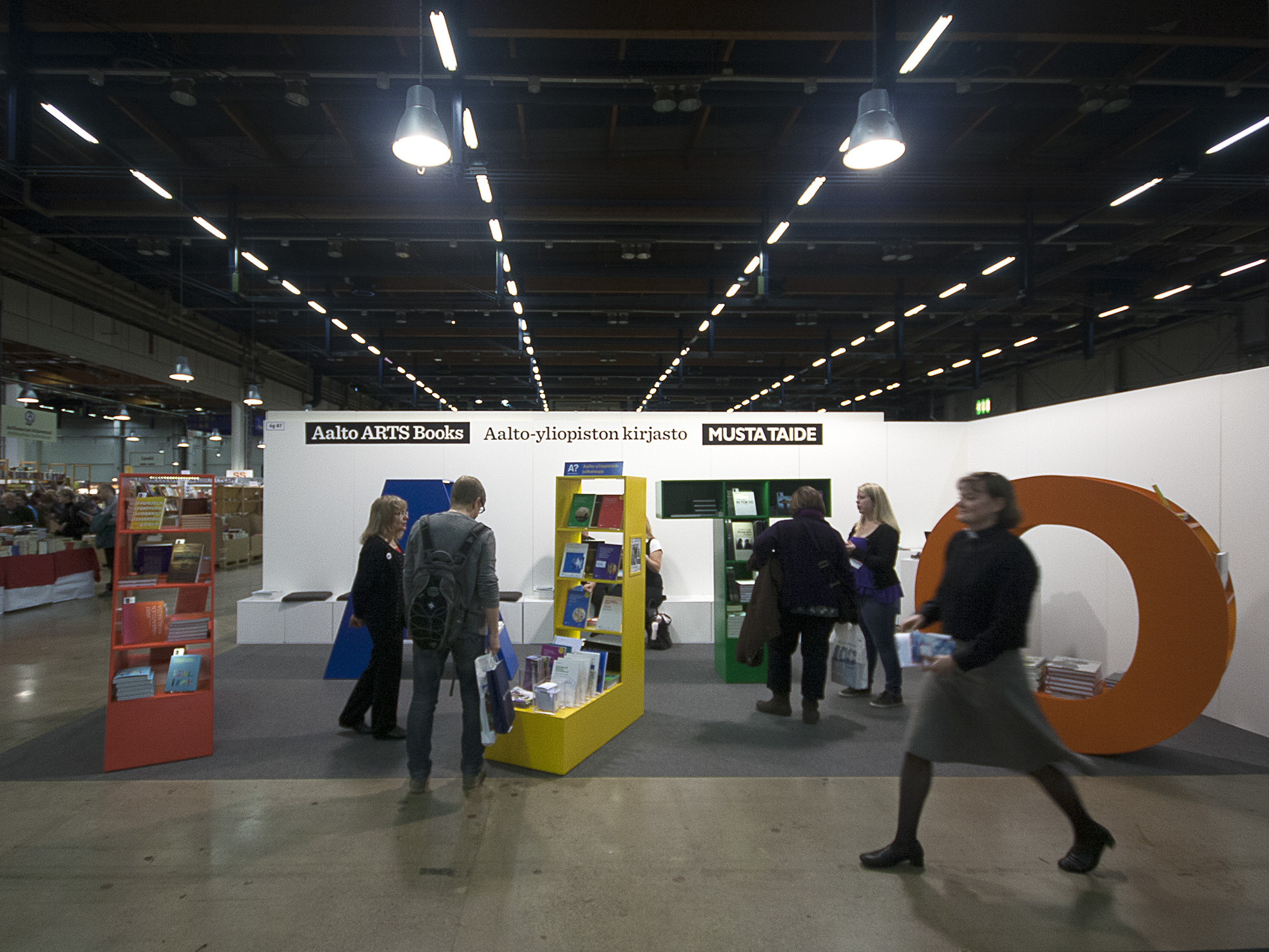
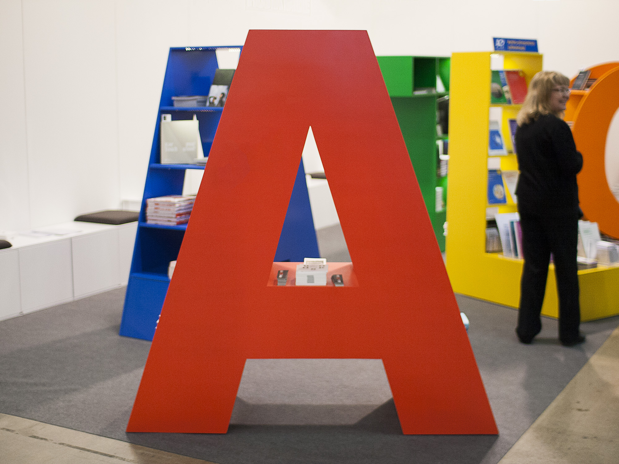
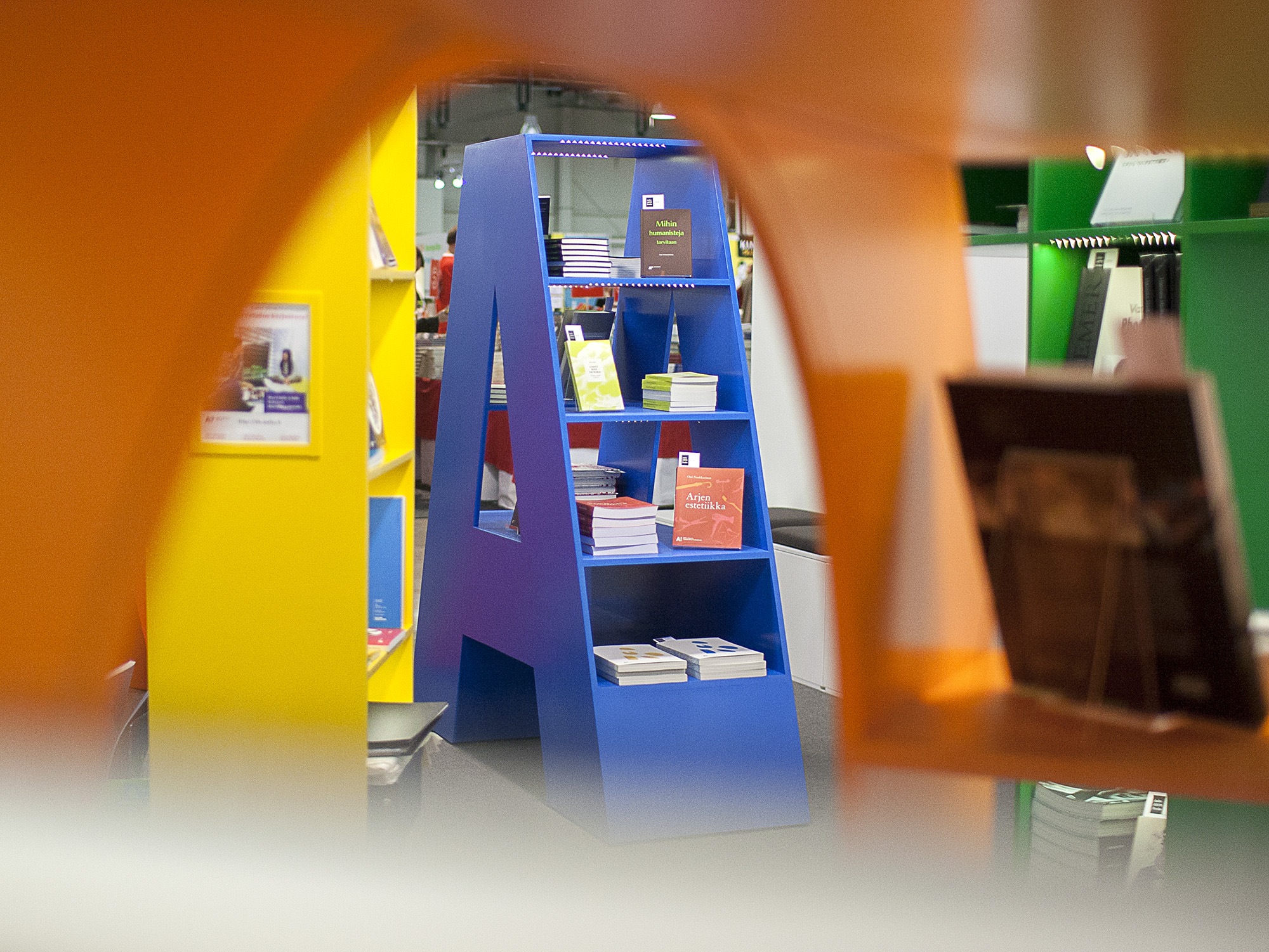
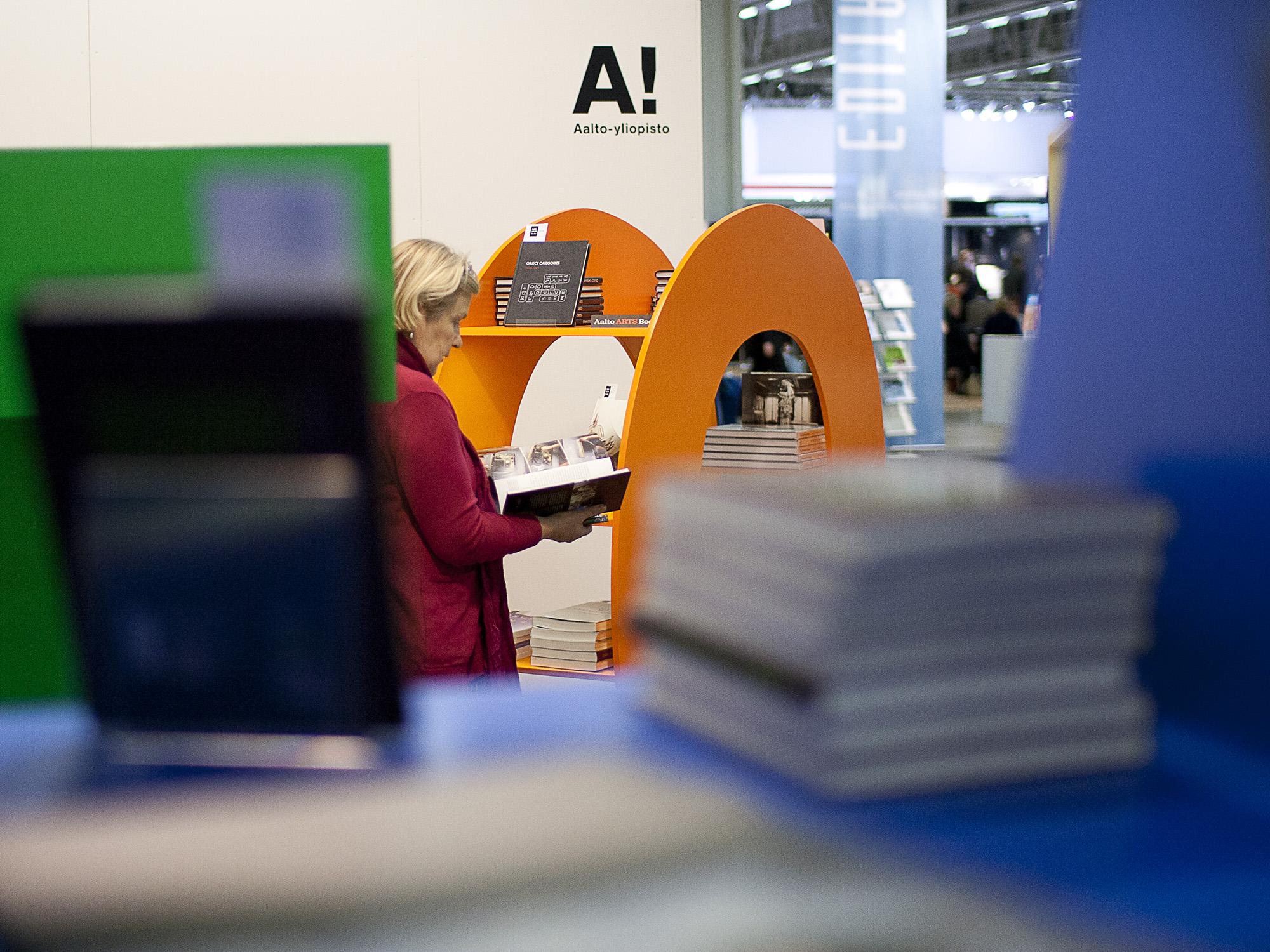
Designed as the result of a design competition, this book fair stand leans toward a somewhat naive design language. Following the theme of the fair, the stand consists of five massive letters forming the word "AALTO." The typeface and colors are based on Aalto University's official identity.
Otherwise kept minimalistic, the stand consists of a row of benches placed against the wall, which also serve as storage space, and a simple sales counter.

Process
